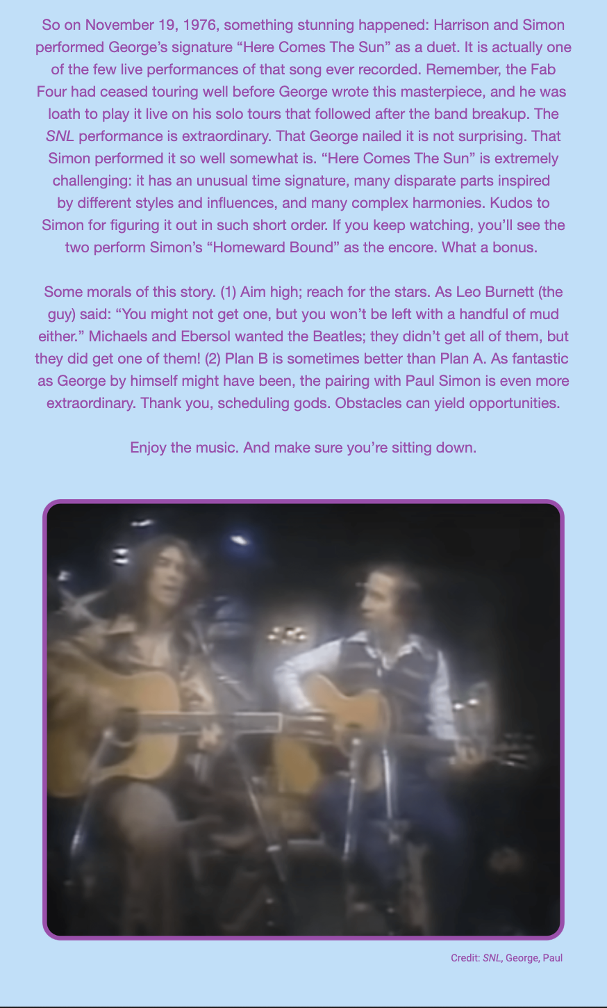
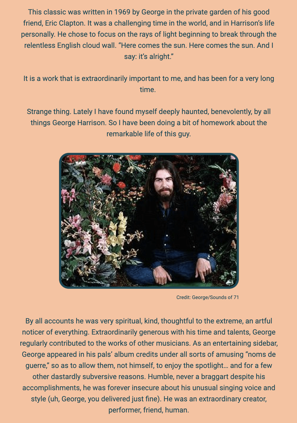
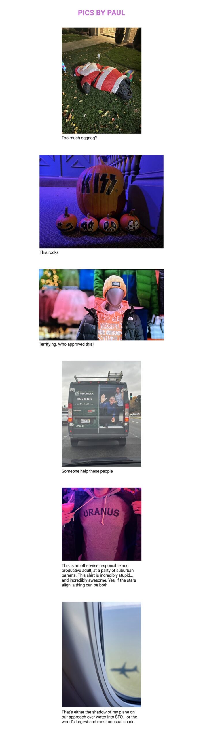
Author:
adayinthesun
S1/V4
Posted on
December 1, 2023
January 23, 2024
by
adayinthesun
S1/V3
Posted on
September 1, 2023
January 23, 2024
by
adayinthesun
S1/V2
Posted on
August 1, 2023
January 23, 2024
by
adayinthesun
S1/V1
Posted on
June 1, 2023
January 22, 2024
by
adayinthesun
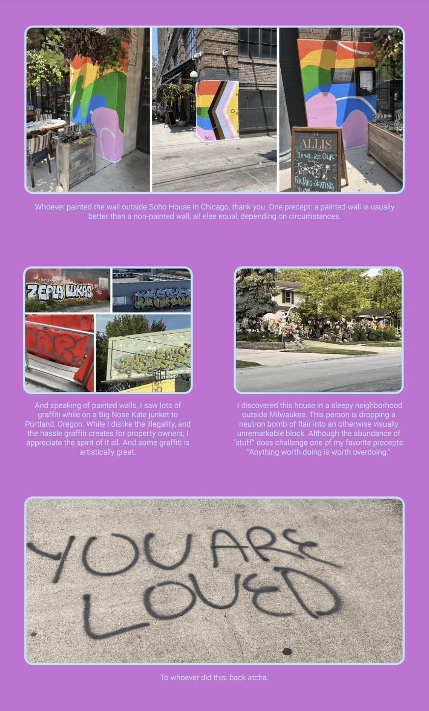
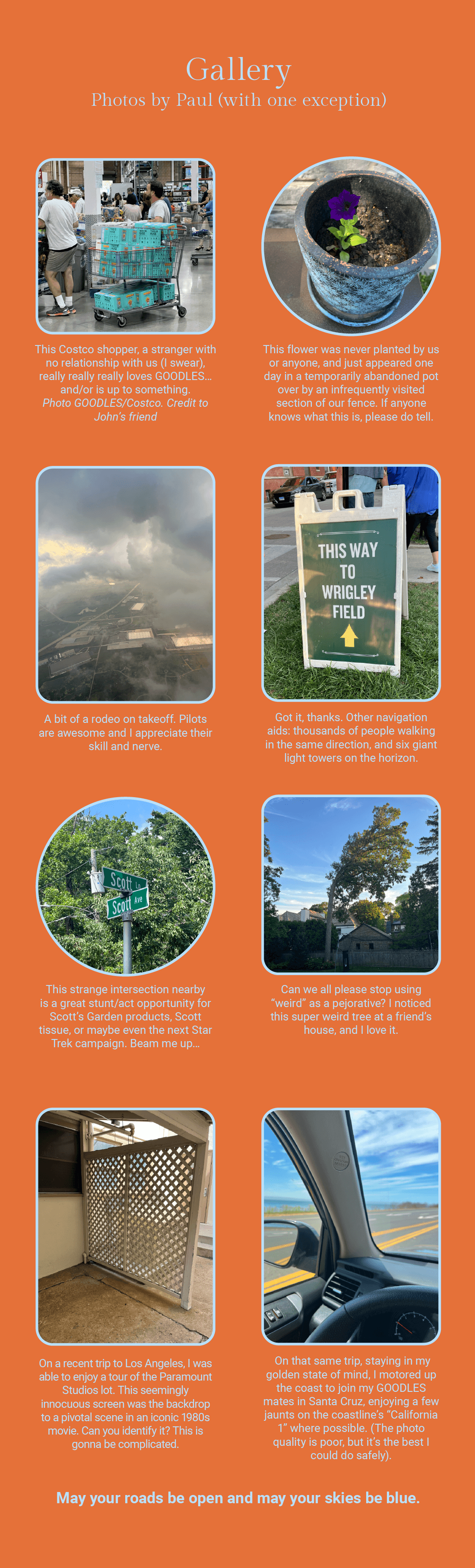
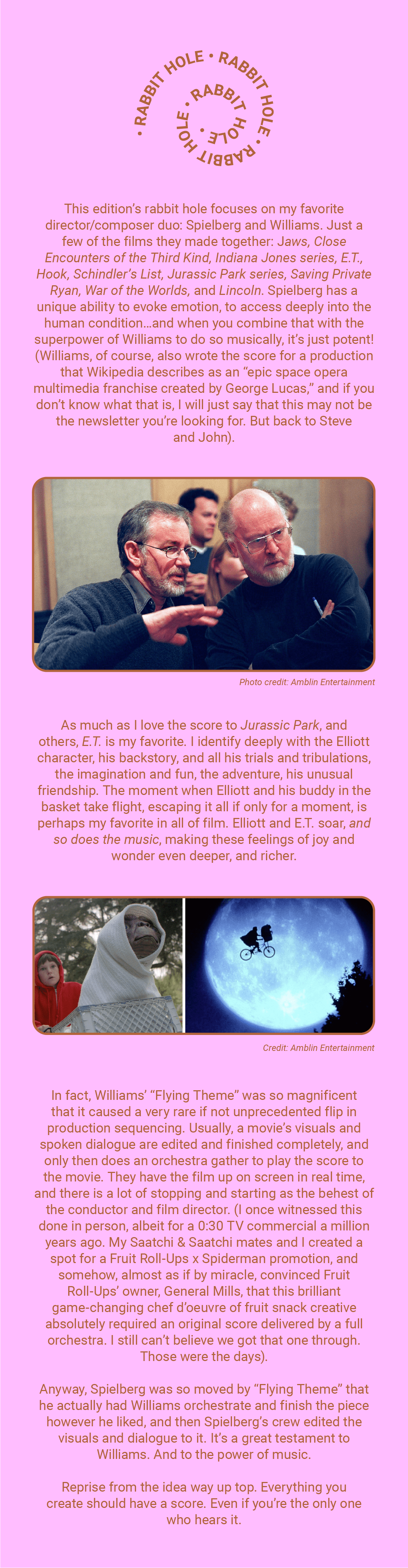
![The image is a simple text-based graphic for a newsletter titled "NEWSLETTER S1 V4." with a date of December 22, 2023. Below the title, it states "By Paul Earle," indicating the author. The text further reads "Musings with a dash of bluster at the intersection of brands, creativity, and entrepreneurship" which suggests the content theme of the newsletter. At the bottom, a playful comment adds "[4-minute read; 2 if you skim; 0 minutes if you blow this off entirely]," which humorously estimates the time it would take to engage with the newsletter's content depending on the reader's level of interest. The text is set against a plain white background, with the title in bold orange letters and the rest of the text in black.](https://adayinthesun.com/wp-content/uploads/2024/01/S1V4-2.jpeg)
![The image shows a piece of text and a photograph of a bird. The text reads:
"Below is a red-winged blackbird, a stunningly beautiful creature. I love the vibrant red/orange/yellow epaulets, the onyx feathers with a sheen, and the perfect proportions in form. As a design nut, chef’s kiss to the red-winged blackbird. This little bird also, however, happens to be a big-time a*shole, a contemptible nasty bastard to the extreme. If you unwittingly roam anywhere near what they believe is “their territory,” they will angrily screech at you... and even physically attack you, dive bombing your head with claws out, and the beak transformed into a weapon. I was a victim of one such attack this fall. This craven act of aggression was not only startling, it really hurt. So I’m plotting my revenge. A longtime fan of biomimicry as a creative approach, I will co opt the red-winged blackbird’s gorgeous design scheme, and use it on a consumer product one day. No royalties. They won’t like that either and will evolve to be even more ornery. Too bad."
The accompanying photograph shows a red-winged blackbird perched on a piece of wood, with its distinctive red and yellow shoulder patches visible against its glossy black body. The bird's mouth is open as if it is calling or singing. At the bottom, there is a caption that says "The Red-Winged Blackbird [Totalum Jerkus Maximus]".](https://adayinthesun.com/wp-content/uploads/2024/01/S1V4-8.jpeg)


![The image displays a section of text that is highlighted as a brand manifesto from Lyft. The text praises the manifesto for its alignment with the company's external image and messaging, expressing a wish that they had been involved in its creation. The manifesto itself speaks to themes of adventure, self-assertion, and individuality, rejecting conventional limits and embracing personal branding and expression. It uses bold language to encourage not being afraid to stand out or make noise, and emphasizes living life to its fullest rather than adhering to a monotonous routine. The manifesto concludes by stating that it's about the individual, not the company.
The visible text in the image reads:
"The Lyft brand manifesto has been making the rounds, for a reason: it is awesome. We do a fair amount of brand strategy, and each time I proselytize that the words and tone/spirit you use internally should sync exactly with what appears externally. Here’s Exhibit A. [Note: we didn’t do this one, but I wish we had].
Credit: Lyft"](https://adayinthesun.com/wp-content/uploads/2024/01/S1V2-7.png)
![The image features a snippet of an article and a photo related to the High Line in New York City. Here is the alt text including all of the text that appears in the image:
"Text on a background featuring a photo of the High Line’s new bridge. The image shows a man and a woman walking on a pathway flanked by greenery and modern wooden design elements, with city buildings in the background. The text reads: 'Loved this piece on the improvements coming to the High Line in NYC, encouraging even more walking. There is a ton of data supporting the notion that people think more clearly when moving. Some of the all-time best conversations I have had with my GOODLES partner, Jen, took place while walking...either together in person, or 2,000 miles away via phone. Peace in the Middle East was achieved (for a fleeting moment) while the key principals moseyed through the woods in Camp David. We advise all our clients and partners to get moving! — The High Line’s fancy new bridge just made a slice of NYC much more walkable The L-shaped bridge, designed by Skidmore, Owings & Merrill and James Corner Field Operations, stands to make a small stretch of Manhattan much more pleasant for pedestrians. [Image: Andrew Frasz/courtesy Skidmore, Owings & Merrill]' At the bottom of the image, there is a credit that states 'Credit: Fast Company'."](https://adayinthesun.com/wp-content/uploads/2024/01/S1V2-10-851x1024.png)