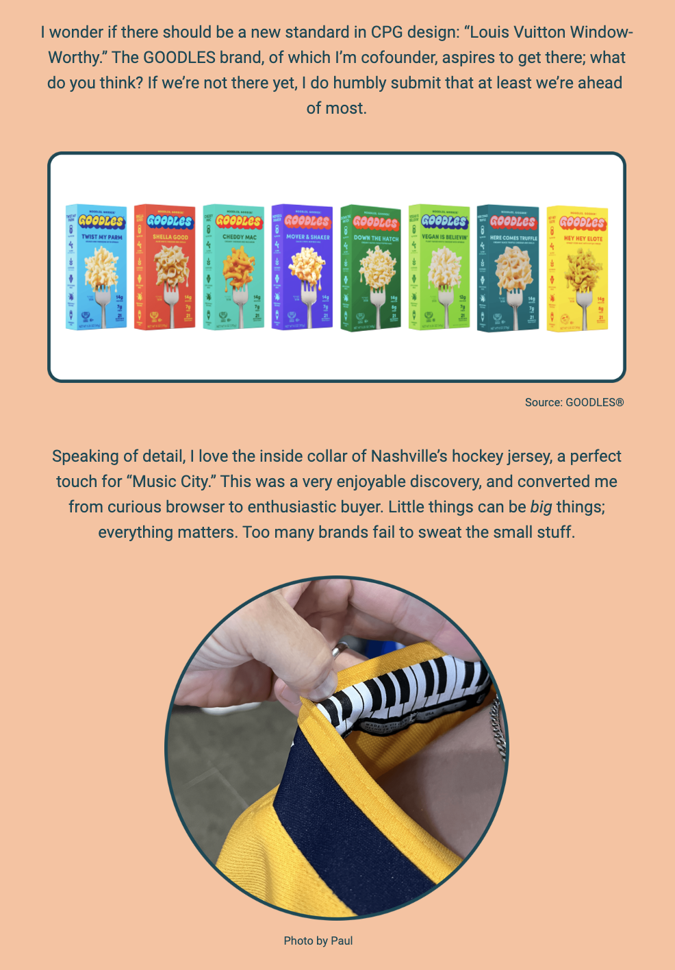
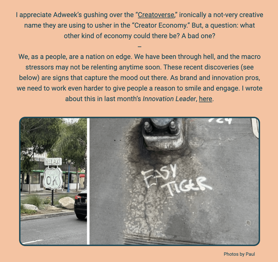
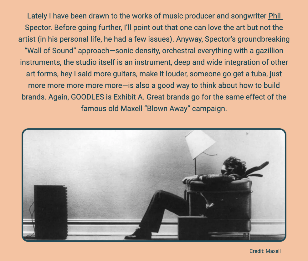
MANIFESTO

S1/V1

A Day In The Sun
The image is a digital flyer or newsletter. The background is a gradient of purple at the top, transitioning into a dark blue at the bottom. At the top, in a bold, sans-serif font, it reads, "Hello! Paul here. The newsletter is back and let’s open with a doosey: effective today, Earle & Company has become A Day In The Sun®." Below the text is a grid of nine images with a color palette to the right. The images depict various scenes such as a colorful storefront, a decorated car, a simple egg on a stand, landscapes, a person exercising, musical instruments, a butterfly, a sunset, and a statue. At the bottom, there is more text that says, "The foundational belief is simple: through creativity and entrepreneurship, all skies will be blue. We have always been about helping our partners achieve bright future states, anyway. The brand further aims to convey a spirit of optimism, a powerful force that must pervade in all innovation centers." The overall design suggests a rebranding announcement, with a focus on creativity, optimism, and innovation.
The image showcases an abstract rainbow arch with vibrant colors blending into each other against a blue background, beneath which is the text "A Day In The Sun is the desired outcome for all people and ideas." Below the rainbow, there is additional text that describes the offerings at ADayInTheSun.com, including activities referred to as "Applied Entrepreneurship™," which encompasses creativity-themed learning and development workshops, new brand venture creation, and custom senior leader advisory. The writer expresses excitement about sharing more information regarding the new brand and jokingly anticipates the reader's disbelief in the amount of content yet to be shared. The passage ends by inviting the reader to explore further, humorously referring to a "rabbit hole at the bottom" for more details.

The text within the image reads:
"Over at ADayInTheSun.com, check out our evolving stable of activities. We call it "Applied Entrepreneurship™": creativity-themed learning and development workshops; new brand and venture creation; and custom senior leader advisory.

I have lots more to share about the new brand. ("Really Paul, you do? I can’t believe that," said nobody.) In the interest of brevity, I’ll park it a rabbit hole at the bottom."
The image shows a plain, orange background with centered text in a large, serif font. The text reads: "Putting the 'news' in 'newsletter,' I'm further ushering in a new format. I'll be sharing some thoughts about happenings at the intersection of brands and ventures broadly; some 'words about words,' being the hopeless naming and nomenclature nerd that I am; a look inside the ropes of our own adventures; and a small gallery of visual fancies. Here goes." This text suggests an introduction to a series of topics that will be discussed within the newsletter, emphasizing a focus on branding, linguistics, and personal insights.
The image is a collection of photographs under the title "Things I Think I Think," showcasing vibrant and creative window displays. The author shares their reflections on the importance of color and detail in design, mentioning the use of negative space in The Beatles' "White Album." They express their delight in observing the colorful displays during a visit to Beverly Hills, particularly after walking around Rodeo Drive and appreciating the effort put into the window designs of high-end stores, referred to here as "superlux ateliers."

The series of photos illustrates various storefronts, each with unique and artistic arrangements that celebrate color and creativity. These include a whimsical display with a green figure, a vibrant window with oversized balls of yarn and a mannequin dressed in a patchwork outfit, a red-themed window featuring a stylish handbag, and a playful setup with toy-like figures.

The text within the image reads:
"Thankfully, color is in bloom, and detail is in. Tiny sans serif font and expansive negative space works great for The Beatles’ 'White Album,' but not much else. Below is one example of color strutting its stuff. I was recently in Beverly Hills, and had about an hour after my meeting before I had to head for the airport. Walking around Rodeo Drive and checking out the display windows of the superlux ateliers, I was thrilled to see color studies so joyously on parade.

Photos by Paul"
The image features two sections of a newsletter. In the top section, the author speculates about setting a new standard in Consumer Packaged Goods (CPG) design that he terms "Louis Vuitton Window-Worthy" and references the GOODLES brand, of which he is a cofounder. The brand aspires to meet this standard of design excellence. Displayed is an image of various GOODLES macaroni and cheese products with colorful packaging.

The image displays a collection of packaged macaroni and cheese products from the GOODLES brand, with a variety of flavors shown. The text above the image discusses a hypothetical new standard in consumer packaged goods (CPG) design, likening it to the appeal of a "Louis Vuitton Window-Worthy" product. The author, a cofounder of GOODLES, expresses the aspiration for the brand to reach such a standard and suggests that they are at least ahead of many others in the industry.

Below the product image is a separate photo and accompanying text, reflecting on the detail found in a Nashville hockey jersey's inside collar, which the author appreciated as a touch for the "Music City." The photo shows someone's hands adjusting the collar of the jersey to reveal the design. The author notes this discovery led them from a curious browser to an enthusiastic buyer, emphasizing the idea that small details can be significant and that many brands overlook such nuances.

The text within the image reads:
"I wonder if there should be a new standard in CPG design: 'Louis Vuitton Window-Worthy.' The GOODLES brand, of which I’m cofounder, aspires to get there; what do you think? If we’re not there yet, I do humbly submit that at least we’re ahead of most.

Speaking of detail, I love the inside collar of Nashville’s hockey jersey, a perfect touch for 'Music City.' This was a very enjoyable discovery, and converted me from curious browser to enthusiastic buyer. Little things can be big things; everything matters. Too many brands fail to sweat the small stuff.

Source: GOODLES®

Photo by Paul"
The image is a section from a newsletter or an article. It includes two photographs at the bottom with captions, against a background with text discussing the current state of the economy and society.

The upper part of the image contains text that reflects on Adweek's coverage of what they dub the "Creatorverse," part of the broader "Creator Economy." The author questions what type of economy it represents, suggesting a lack of creativity in the name itself. The text then transitions to a commentary on the state of the nation and the ongoing stressors society faces, emphasizing the need for brand and innovation professionals to work hard to uplift people's spirits.

Below the text are two photographs credited to Paul:

The first photo on the left shows a neon sign with the words "RELAX UR OK" in a store window, conveying a message of reassurance amidst stressful times.

The second photo on the right displays the words "EASY TIGER" chalked on a sidewalk, possibly indicating a call for calm or restraint.

The text within the image reads:
"I appreciate Adweek’s gushing over the “Creatorverse,” ironically a not-very creative name they are using to usher in the “Creator Economy.” But, a question: what other kind of economy could there be? A bad one?

We, as a people, are a nation on edge. We have been through hell, and the macro stressors may not be relenting anytime soon. These recent discoveries (see below) are signs that capture the mood out there. As brand and innovation pros, we need to work even harder to give people a reason to smile and engage. I wrote about this in last month’s Innovation Leader, here.

Photos by Paul"
The image features a monochrome photograph of a man sitting in an armchair with a high-powered speaker to his left, illustrating the intense sound force that seems to be blowing his hair and tie backward. This is a reference to the iconic Maxell "Blown Away" advertisement campaign. The scene is staged to show the power of sound, evoking the famous advertisement's message that Maxell tapes deliver a sound so clear and strong it can literally 'blow you away.'

Above the photograph is a block of text where the author expresses admiration for the work of music producer and songwriter Phil Spector, despite his personal controversies. The text highlights Spector's "Wall of Sound" technique, known for its dense orchestral aesthetic, which the author parallels with the concept of building great brands that leave a lasting impression, likening it to the impact of the Maxell campaign.

The text within the image reads:
"Lately I have been drawn to the works of music producer and songwriter Phil Spector. Before going further, I’ll point out that one can love the art but not the artist (in his personal life, he had a few issues). Anyway, Spector’s groundbreaking 'Wall of Sound' approach—sonic density, orchestral everything with a gazillion instruments, the studio itself is an instrument, deep and wide integration of other art forms, hey I said more guitars, make it louder, someone go get a tuba, just more more more more more—is also a good way to think about how to build brands. Again, GOODLES is Exhibit A. Great brands go for the same effect of the famous old Maxell 'Blown Away' campaign.

Credit: Maxell"
The image is a portion of a newsletter with a purple gradient background. At the top, the text speaks about the music industry, questioning if influential musicians like Bob Dylan, Drake, Dolly Parton, or Beyoncé ever talk about "targeting" their "users". It suggests a shift away from such corporate language towards more fan-centric terms. It references an article in Fast Company that looks at artists with highly engaged fan bases, like Taylor Swift and the Grateful Dead, and poses the question of what branding and innovation experts can learn from them.

Below this text, there's a blended image of two separate photographs. On the left, a vintage photo of the Grateful Dead band members, with one member in the foreground holding a cigarette and wearing sunglasses, and others smiling in the background, all enveloped in a haze of smoke. On the right, a modern image of Taylor Swift in a sparkling dress holding a microphone. The two images are overlaid against each other, symbolizing the connection between different musical eras and their passionate fan bases. The credit "Fast Company" is given at the bottom right of the image.
The image features a snippet from a newsletter with a peach-colored background. The text on the top praises an article from The New Yorker about Taco Bell's innovation, suggesting it's an inspiration for both large companies and startups. Following this, there's an anecdote about straightforward branding advice from a friend and collaborator of the author, emphasizing the importance of clear communication in product perception.

The text in the image reads:

"I loved this piece in the New Yorker about the Taco Bell innovation machine, an incredible team and approach that should be inspiring not only to big companies, but startups too.

A longtime great friend and collaborator once told me: "If you want people to perceive the product as premium, then put ‘PREMIUM’ right on the label." (thanks, Stephanie!) We often get so artful in our craft that we forget how effective basic communications can be. With that principle in mind, surely our new chess set must be of excellent quality."

Below the text is a photo of a classic wooden chess set packaging. The design is elegant with a dark blue backdrop and gold lettering. It prominently features the text "CLASSIC WOODEN CHESS SET" along with "MAGNETIC CHESS BOARD & PIECES" and "PORTABLE EXCELLENT QUALITY" as descriptors. In the center is a golden emblem with a silhouette of a knight piece, and the name "VAHOME" is seen at the top of the emblem. This is presented as an example of the principle mentioned above, implying that the chess set is of excellent quality, as stated on the label. "Photo by Paul" is credited at the bottom.
The image is part of a newsletter with a beige background, featuring a commentary on the current trend of predicting doomsday scenarios in relation to AI in the creative field. The author expresses a preference for human creativity over algorithms and gives a nod to someone named Chodrow to stay sharp.

Below the commentary is a circular close-up photograph of a pair of socks, with the word "WORN" prominently featured on each sock and the letters "L" and "R" to denote the left and right socks. This image is used to illustrate the author's irritation with unnecessary problems, like the specification of socks for left and right feet, suggesting that innovators should focus on solving real problems instead of creating new ones. The photo credit at the bottom reads "Photo by Paul."

The text within the image reads:
"It seems to have become fashionable to panic about AI these days, especially as it pertains to the creative field, with each futurist issuing dramatic doomsday predictions designed to out-freak the prior one. Aaaaah! Maybe I’m naïve, or just lucky to work with such incredible partners, but when it comes to creative expressions, my money is on people, not algos (for now, at least—stay sharp, Chodrow).

Innovators need to solve problems, not create them. Who the (expletive) asked for socks with left/right denotations? This was quite aggravating to me, and actually is a cautionary tale with far-reaching implications.

Photo by Paul"
The image is a newsletter segment with a playful pun on the future of meat and dairy. The author shares a personal story about taking their 11-year-old son to see the film "Air," which is about the creation of the Air Jordan shoe. They describe embarrassing their son by applauding during the movie's key creative moments and becoming emotional at the end when the credits revealed the real people involved in the story.

Below the text is a movie poster for "Air," featuring a collage of characters from the film, portrayed by actors wearing 80s fashion and sporting confident, enthusiastic expressions. The poster includes names such as Damon, Affleck, Bateman, Wayans, Messina, Tucker, and Davis. The tagline "COURTING A LEGEND" is visible, along with the text "EXCLUSIVELY IN THEATERS APRIL 5" and the logos for Amazon and Warner Bros. The credit at the bottom of the image reads "Credit: Amazon/Warner Bros."

The text within the image reads:
"I think the future of meat is, wait for it, meat. But the future of dairy is a bit more muddled.

I took my 11 year old son to see “Air,” a wonderful film about the conception, design, and launch of the Air Jordan shoe (and weightier things). I embarrassed this poor kid by applauding during the scenes of key creative breakthroughs, and then again by welling up when credits rolled and we saw the real people behind it all. “DAD!!!!!” Anyway, see the movie...

Credit: Amazon/Warner Bros."
The image is a part of a newsletter or article with a blue background. At the top, the text expresses the author's admiration for the book "The Art of Noticing" by Rob Walker. It emphasizes the importance of being observant and engaging all senses, suggesting that it is a particularly good time to absorb the world around us, which could lead to new ideas.

Below the text is a three-dimensional rendering of the book mentioned. The book cover is a light blue with a yellow detail, and the title "The Art of Noticing" is prominent. Below the title, the cover reads "131 Ways to Spark Creativity, Find Inspiration, and Discover Joy in the Everyday" by Rob Walker. The cover art is simple and modern, with a credit at the bottom that reads "Credit: Rob Walker/Penguin RH."

The bottom of the image returns to the author's voice, providing a concluding thought that despite the "well-publicized storminess" in the world, it remains an excellent time to create something new.

The text within the image reads:
"One of my all-time favorite books and life lessons is The Art of Noticing by my friend Rob Walker. We need to look up and around, not down (unless you're noticing sidewalk art). Engage all senses. This is an especially great time of year to soak it all in. Hyper tune in to the world around you, and a few new ideas will start to percolate.

The Art of Noticing
131 Ways to
Spark Creativity,
Find Inspiration,
and Discover Joy
in the Everyday
ROB WALKER

Credit: Rob Walker/Penguin RH

Despite all the well-publicized storminess out there, it is still a great time to create something new."
The image features a dark blue background with bold yellow text at the top that says, "A few words about words: discovery of artful and interesting names." The author shares their fascination with creative and unique brand names. Each brand is listed with a playful commentary:

"Hen of the Woods, a brand of snacks (hen-free, no less)..."
"An aluminum forger called Anchor Harvey, more evidence that anything can be cool with the right words..."
"A new phone service called Really, for real..."
"A 'better marshmallow' called Dandies (is their mascot named Jim?)..."
"A line of pickled products called Suckerpunch and for that matter, I also like the word 'pickle' itself, as long as I don’t find myself in one..."
"A line of spicy foods called Henrietta Said (Henrietta? Well, Jane already spoke. She’s done with Sergio*)..."
"Bbbbbbb Belgian Boys, and to continue the alliteration, Desert Door, a delight..."
"Brightland olive oils et al, because, well, we like things that are sunny..."
The text ends with an em dash, indicating a continuation of thought or a list. The playful and thoughtful selection of names reflects the author's appreciation for clever naming in branding.
The image features a continuation of a newsletter or article with a focus on the joy of creative and evocative brand names. The text is set against a vibrant orange background and includes the following thoughts and brand names:

"De Soi beverages, because the pronunciation is not obvious (it’s 'de SWAH' if you’re wondering), and it’s just a blast to say out loud, especially with a little theatrical flair and panache..."
"One Trick Pony nut products, for the focus and humility with fun..."
"Starry (yes, a corporate creation), because it is so dreamy, and in fact for years 'Starry' has been on my own long rolling list of 'great words and phrases that could be brands for something one day'..."
"And I like Snow Days for that exact same reason..."
"Bobbie baby food, because it may set a record for the yield of 'B,' a magic letter..."
"Finally, Hero. It may be a little 'on the nose' (pun sort of intended), there is still a ton to like and I declare it to be WAWW ('Words About Words-Worthy'). Kudos to the Church & Dwight crew for the journey to bring it in.
I love language. It has such a huge impact on brands, businesses and, well, everything. Which is why I collect words and phrases the way people collect stamps or coins.

**Without Googling, the above reference to Jane and Sergio will probably be known only by a very small portion of this or any audience, especially those born after 1985. But I’m leaving it in. Remember, discoverable detail!"

This section emphasizes the writer's fascination with language and its impact on branding, highlighting a collection of brand names that strike a particular chord in terms of linguistic appeal or cleverness. The writer also shares a personal hobby of collecting words and phrases and acknowledges that some cultural references may not be widely recognized.
The image features a section of text from a newsletter with a deep blue background. The heading, in a large purple font, reads "Inside the ropes: a glimpse of some 'design thinking doing' in which we're involved." The text below, in a lighter shade of blue, indicates that it has been a busy time with many highlights and new ventures where the author's team plays a significant or supportive role, which will be detailed in alphabetical order.

The first highlight mentioned is "Betr Remedies™," which successfully completed a pilot at Walmart and plans to expand to other retail customers. The company's social mission is to provide medicine to those in need with every purchase. The author notes the significance of this mission, stating it is often absent in larger companies. The text implies that everyone should contribute to health and wellness and mentions that "Betr Remedies team is doing its part. More smart capital just came in and Ellen Pompeo continues to spread the good word."

The text within the image reads:
"Inside the ropes: a glimpse of some 'design thinking doing' in which we're involved

Things have been a little busy. Highlights, around the horn, on new ventures, and other goings on, in which we have a major role or at least supporting one. I’ll go in alphabetical order.

Betr Remedies™ completed a successful pilot at Walmart and is soon rolling to other retail customers. The social mission—every purchase helps provide medicine to those in need—is resonating. Why? Because this depth of commitment to mission is almost entirely absent in the big incumbents. Broad-based health and wellness requires everybody to contribute, and the Betr Remedies team is doing its part. More smart capital just came in and Ellen Pompeo continues to spread the good word."
The image is a newsletter update that includes a section of text and two images related to the brand Big Nose Kate® western whiskey. The text announces the brand's strong start and the involvement of Melissa McCarthy and Ben Falcone as investors and advocates, praising them as A+ individuals. It details the brand's content shoot in Santa Fe, New Mexico, describes the entertaining experience, and notes the brand's expansion to distribution in six states, with plans for more. The text also alludes to the historical figure of Big Nose Kate, suggesting she is observing the brand's progress from the afterlife and humorously insinuates she was the one running the show, not her partner Doc Holliday.

The top image is of a whiskey bottle labeled Big Nose Kate® with an old-fashioned photo of a woman, presumably Kate, in the label design. The bottom image is a magazine cover titled "AMERICAN WHISKEY" featuring Melissa McCarthy and Ben Falcone, with a caption about them joining to tell the story of Big Nose Kate. The cover also includes other whiskey-related texts such as "24 WHISKEYS TASTED" and "BAR GUIDE" along with other brands and names like "BLUE RUN - HIRSCH - TALNUA - YELLOWSTONE."

The text within the image reads:
"Big Nose Kate® western whiskey is off to a strong start. Big news there: Melissa McCarthy and Ben Falcone have joined the effort as investors and advocates. They are just A+ people and professionals, in that order of notability. And suffice it to say our first content shoot together at the brand’s home base in Santa Fe, New Mexico was as entertaining as you’d think it would be, and then some. Big Nose Kate is now physically distributed in six states, with more coming soon, and is further available via our website (above) in another 32 states. We believe our hero and namesake, Kate herself, is watching all this from the saloon above and declaring: “It’s about (expletive) time!” This incredible person has lived in the shadow of her business and life partner Doc Holliday forever, even though she was running the show, not that dude. Cheers.

Source: Big Nose Kate®"
The image contains a text excerpt discussing the success of various products and brands. The first paragraph speaks about "Dottie’s oatmilk crème liqueur," which is gaining popularity in Chicago and starting to catch on in Wisconsin, humorously noting the regional Bears vs. Packers rivalry. Dottie's is touted as a superior alternative to a major, unnamed competitor.

The second paragraph focuses on the brand GOODLES®, which is experiencing a surge in distribution. The product line is expanding, with new mac and cheese varieties like "Here Comes Truffle™" and "Hey Hey Elote™," plus three new pasta items, with "Curveballs™" being a personal favorite of the writer. The brand's fans are highly engaged, sending love letters, and the team behind GOODLES® is praised for their daily enjoyment of work. The writer also mentions the excitement surrounding their booth at the Expo West show, partly because their partner, Gal Gadot, was in attendance. The success at Costco road shows and the overall positive reception of the brand is likened to a "big joy machine." The sentiment concludes with a familial affection for the team and a recognition of the hard work ahead, maintaining a steady pace as they continue to progress.

The text within the image reads:
"Dottie’s oatmilk crème liqueur continues to win hearts and minds in our Chicago pilot market, and our friends north of the border in Wisconsin are now getting on board too (all is well until Bears v. Packers enters the dialogue). Dottie’s is a way better contemporary alternative to the incumbent colossus, which leads me to the next point...

GOODLES® continues to amaze, as points of distribution are exploding in number, and our product line is growing too (Keep your eyes peeled for our two latest mac varieties, Here Comes Truffle™ and Hey Hey Elote™, and three new pasta items, my personal fave being Curveballs™). Fans are literally sending us love letters, Jen continues to build out a fantastic team that has fun every day, the Expo West mega show was a circus and not just because our partner Gal Gadot was working our booth for a while, Costco road shows were also happy mob scenes, and the whole ball of noodles has been one big joy machine. I have never seen anything like this, and most involved would say the same. I love the crew like family. We know that so much more hard work is ahead, and will just try to stay even keeled as the magic carpet ride rolls on."
The image is a newsletter update about a product called Small Wonder®. The text above the image discusses the development of this "salon-grade" powder concentrate shampoo, which is nearing the end of a two-year R&D phase and is in its early beta form ready for release to the public. The shampoo is described as transforming into a luscious, great-smelling lather when exposed to water in the shower. The product's dual benefits are likened to Batman and Robin, where "Batman" represents the shampoo's effectiveness and enjoyable use, and "Robin" symbolizes its reduction of clutter and waste due to its non-liquid form, implying no need for heavy packaging and no plastic involved.

Below the text is a visual representation of the product, featuring a pink cylindrical bottle with a metallic gold cap, labeled "SMALL WONDER" and "CONCENTRATE SHAMPOO." The bottle is centrally positioned against a background that appears to be a wall with a large, cracked hole, suggesting a breakthrough or innovation. The source of the image is credited to Small Wonder®.

The text within the image reads:
"After well over two years in R&D and planning, Small Wonder® will soon become available to the general public. It’s a rough early beta, but even that is a major accomplishment. SW is a “salon-grade” powder concentrate shampoo that transforms into luscious great-smelling lather when exposed to water right in the shower. The proposition is Batman and Robin. Batman: it works extremely well, a metaphorical Porsche, and actually makes showering fun. Robin: it reduces clutter and waste in people’s lives, because there is no heavy pre-packaged watery goop, and no plastic, either. Beautiful. If intrigued, check out the site via the link above, and sign up for updates. SW tackles not just one but many wicked challenges all across the spectrum of design, and has been 100x tougher than I ever dreamed. But anything worth doing is going to be difficult.

Source: Small Wonder®"
The image is a section of a newsletter or article with a background gradient transitioning from blue at the top to white at the bottom. The text shares the author's gratitude towards their business partners and avoids turning the note into an "Oscar acceptance speech." The author extends thanks multiple times and reflects on their enjoyment of client collaborations and designing learning and development workshops throughout the year. There's a mention of branding assignments and a strong belief in the accessibility of entrepreneurial behaviors and mindsets to everyone. The text concludes with a commentary on teaching, specifically at Northwestern's Kellogg School of Management, where the author welcomes the new challenge of teaching a course called "New Venture Discovery" after a long stint teaching "Corporate Innovation & New Ventures."

In the second part of the text, the author mentions a student project named "BUFFY™" in the protein space and praises the name and business concept behind it. The author expresses enjoyment in working with industrious future leaders at Kellogg, finding it rewarding despite the demands on their time.

Below the text, there's an image of the exterior of the Northwestern Kellogg School of Management building. People are seen walking in and out of the modern glass-fronted building, indicating a lively academic environment. The source of the image is credited to Northwestern University.

The text within the image reads:
"After well over two years in R&D and planning, Small Wonder® will soon become available to the general public. It’s a rough early beta, but even that is a major accomplishment. SW is a “salon-grade” powder concentrate shampoo that transforms into luscious great-smelling lather when exposed to water right in the shower. The proposition is Batman and Robin. Batman: it works extremely well, a metaphorical Porsche, and actually makes showering fun. Robin: it reduces clutter and waste in people’s lives, because there is no heavy pre-packaged watery goop, and no plastic, either. Beautiful. If intrigued, check out the site via the link above, and sign up for updates. SW tackles not just one but many wicked challenges all across the spectrum of design, and has been 100x tougher than I ever dreamed. But anything worth doing is going to be difficult.

Source: Small Wonder®"
The image is a collection titled "Gallery: Pics by Paul" and features four photographs each with a caption.

The top left photo shows a sunrise over Lake Michigan at 7:05 AM in mid-March. The caption reflects Paul's moment of pause during his run to appreciate the view, expressing gladness for doing so.

The top right photo is of a sign with the word "BONCI" on it. Paul expresses he has no idea what the event is but appreciates the name and illustration. He recalls a saying by an old creative partner, Dabni, that a great idea is like fine pâté: you don't have to understand it to enjoy it.

The bottom left photo displays a red illuminated sign saying "LIVE ON AIR." The caption suggests that the image contains multiple brand ideas that Paul is considering, but not at the current moment.

The bottom right photo shows a car parked in a way that takes up two parking spaces in a parking lot. The caption is a reminder that there is a good and bad way to be subversive and disruptive, noting that the offending car is not Paul's.

The text within the image reads:
"Gallery: Pics by Paul

Sunrise over Lake Michigan, 7:05 AM, mid-March. I paused my run to take it all in, and am really glad I did.

I have absolutely no idea what this event is, but I love the name and also the illustration. An old creative partner, way back when (thanks, Dabni!), once told me that a great idea is like a fine pâté: you don’t have to understand it to enjoy it.

There are several different mongo brand ideas baked into this one image. Working on it. (Well, not right now. But maybe one day.)

A reminder that there is a good way to be subversive and disruptive, and a bad way. Just so ya know: the offending car is not mine."
The image is a montage of four photographs with accompanying captions, suggesting moments of inspiration and appreciation in everyday life.

The top left image shows a bird perched on a ledge with green foliage in the background. The caption by Paul expresses admiration for the bird, mentioning a desire to name something "CARDINAL" in the future and acknowledging the beauty of the bird's aesthetics as a source of design inspiration, though he’s not sure what product or service it could be associated with.

The top right image is an accidental photo taken of a ceiling, showing a light fixture with geometric patterns. The caption reflects on the value of accidents in an innovator's journey, suggesting that such unexpected moments can be golden and worth keeping.

The bottom left image is a view from an airplane window during a sunset or sunrise, with the wing visible against a gradient sky. The caption notes this view was from Paul's return from a successful Expo West show with the GOODLES team in March, mentioning the scene is enhanced by a glass of wine and represents a moment of reflection and gratitude. He humorously clarifies that two glasses of wine were actually involved and that the photo is unaltered.

The bottom right image displays a portable chair with a built-in shelter designed to protect from the elements. The caption relates this innovation to the earlier mention of solutions for baseball parents attending games in rain or cold, implying that this invention is a lifesaver for those situations, especially common in the Chicago area during spring.

The text within the image reads:
"This guy has been hovering around my office window lately. There are many reasons to appreciate this type of bird, but as a design nut, I go right to the stunning aesthetics. I would love to name something CARDINAL™ one day, if only for the design opportunity (absolutely no idea what product or service that might be; that’s but a detail).

I took this photo of my ceiling entirely by mistake... and decided to keep it. A valuable lesson here in any innovator’s journey: accidents can be gold. Consider hanging on to some of them. At least make a file.

View from my window seat on the way home from a very successful Expo West show with the GOODLES team in March. The glow was enhanced by a glass** of wine, a meaningful moment of reflection and gratitude. This photo is not altered in any way, btw.
**Okay, two

Remember the earlier riff about the need for innovations to solve problems? This one does, beautifully. A near life saver for baseball parents, like me, attending games in rain and/or extreme cold. Which is basically 'all of them' in the Chicago area in the spring."
The image is a concluding message from a newsletter or document, set against a gradient background transitioning from a warm orange at the top to a deep blue at the bottom. The text, in a bold serif font, expresses gratitude to the reader for engaging with the content and encourages staying in touch or re-connecting. It finishes with an invitation to see each other in the "green fields" and a sign-off with the word "Onward." Below this message is a reminder about a "rabbit hole," suggesting a deeper level of engagement or information available for those interested in exploring further.

Below the text is an illustration of a person in motion, drawn with a single continuous line in a bright orange color. The figure appears to be walking away from or into a spiraled shape on the ground, which represents the "rabbit hole" mentioned in the text.

At the bottom of the image, in the blue section, is the contact information for Paul Earle, referencing "A Day In The Sun®" with an email address (Paul@ADayInTheSun.com) and a physical address (909 Davis Street, Fifth Floor, Evanston, Illinois USA 60201).

The text within the image reads:
"If you have scrolled down this far, thank you. And so begins a new chapter. Keep in touch. Or if it’s been a while, get in touch. Thanks to everybody. See you out in the green fields. Onward.

(And remember: there is a rabbit hole, if you choose to scroll down and enter it)

Paul Earle
A Day In The Sun®
Paul@ADayInTheSun.com
909 Davis Street, Fifth Floor
Evanston, Illinois USA 60201"
The image is a text excerpt from a document or newsletter with the title "Rabbit Hole: A Day In The Sun®, the name." The background is white with the text in a bold, dark font.

The author, Paul Earle, reflects on the origin of the name "Paul Earle & Company," which he chose in 2017 with some reluctance, noting his general disinterest in the name despite his profession involving naming. He discusses his initial preference for the name "Paranormal™" and the adjacent concept "Werewolf™," but he abandoned these due to others' genuine fears of paranormal phenomena and because a mentor advised against a name associated with war. He mentions that many great names were already taken by others, leading him to settle on "Paul Earle & Co."

Paul then explains the intention behind the name change to "A Day In The Sun®," aiming for a name that was good, fitting the mission, and available. He expresses a desire to help others reach their goals and aspirations, which he metaphorically compares to enjoyable activities such as walks on the beachfront or daytime ballgames — whatever "A Day In The Sun" might mean to an individual.

The text concludes by noting that many creative works are inspired by others, and "A Day In The Sun" is one such composite, drawing particular inspiration from The Beatles song "Here Comes The Sun," especially from George Harrison.

The text within the image reads:
"Rabbit Hole: A Day In The Sun®, the name

So, when I went back out into the wild and hung a shingle in 2017, I rolled with “Paul Earle & Company” as the name... reluctantly. I have never, at any time, liked it. Which is ironic, given that we do a lot of naming and, well, it’s my name. All the others I cooked up and liked had a fatal flaw. Paranormal™ was one (I still love it; please don’t nick it). I also spooled up several adjacencies to this core idea, like Werewolf™. At issue: I found that a few key constituents were actually frightened by paranormal activity, for real. So I ghosted that territory. I also really liked Advance Party™ (thank you for the spark, Henry). I came this close to rolling with it. But a key mentor and advisor of mine nixed that one because it’s closely associated with the early stages of war. That didn’t feel right, and I retreated to base. I uncovered tons of other names that were so great, they were already taken by others. I needed to begin operations and had to call this hot dog stand something, so “Paul Earle & Co.,” it was.

I began the search for a replacement almost right away. And after a million tries to land something that was good, fit the mission, and available for use, I think (I hope?) I did it.

As years fly off the calendar, is becoming more important to me to help others get to where they want to be in their work, and maybe even lives. The destination, metaphorically: that walk on the beachfront, a daytime ballgame with someone you love, a picnic on a beautiful afternoon, your dog or cat basking in the windowsill, a perfectly-illuminated bike path...or whatever “A Day In The Sun” means to you.

Many creative works are composites of inspirations from other creative works, and A Day In The Sun is one.

The first and most obvious influence: Here Comes The Sun, by The Beatles and specifically, George Harrison."
The image is a written tribute to George Harrison, focused on the song "Here Comes The Sun" and Harrison's character. The text is superimposed on a simple background with an image of George Harrison seated in a garden filled with flowers.

The author recounts the creation of "Here Comes The Sun" in 1969 in the private garden of Harrison's friend Eric Clapton, highlighting it as a response to a challenging time both globally and in Harrison's life. The song is described as focusing on the positive aspect of light breaking through the relentless English cloud wall.

The text indicates the song's deep personal importance to the author and mentions a recent deepened interest in George Harrison's life. The author feels benevolently haunted by Harrison's spirit and has been researching his life.

A photo of George Harrison in a garden accompanies the text, with a credit to "George/Sounds of 71." The latter part of the text reflects on Harrison's spirituality, kindness, thoughtfulness, generosity with time and talents, contributions to other musicians' works, and humility despite insecurities about his singing voice and style. The author emphasizes Harrison's nature as a creator, performer, friend, and human.

The text within the image reads:
"This classic was written in 1969 by George in the private garden of his good friend, Eric Clapton. It was a challenging time in the world, and in Harrison’s life personally. He chose to focus on the rays of light beginning to break through the relentless English cloud wall. 'Here comes the sun. Here comes the sun. And I say: it’s alright.'

It is a work that is extraordinarily important to me, and has been for a very long time.

Strange thing. Lately I have found myself deeply haunted, benevolently, by all things George Harrison. So I have been doing a bit of homework about the remarkable life of this guy.

Credit: George/Sounds of 71

By all accounts he was very spiritual, kind, thoughtful to the extreme, an artful noticer of everything. Extraordinarily generous with his time and talents, George regularly contributed to the works of other musicians. As an entertaining sidebar, George appeared in his pals’ album credits under all sorts of amusing 'noms de guerre,' so as to allow them, not himself, to enjoy the spotlight... and for a few other dastardly subversive reasons. Humble, never a braggart despite his accomplishments, he was forever insecure about his unusual singing voice and style (uh, George, you delivered just fine). He was an extraordinary creator, performer, friend, human."
The image is a text passage reflecting on George Harrison's life, particularly focusing on his temperament and contributions as a member of The Beatles. The background is a simple white, and the text is presented in a straightforward, black font.

The author acknowledges that George Harrison, like anyone, could be temperamental and suggests that his frustrations may have been exacerbated by his junior status in the band beneath Lennon and McCartney. The author compares Harrison's position to being a junior member of a sports team led by stars, noting that this would be a difficult situation especially for someone as talented as Harrison, who was also an introvert valuing privacy.

The text goes on to describe how Harrison mellowed over time and began to see the positive side of his experiences with The Beatles. This perspective is reflected in his songs "Here Comes The Sun" and "When We Was Fab." The latter is particularly noted as a nostalgic and appreciative look back at his time with the band.

The text concludes with a lament about Harrison's early death and expresses a belief that Harrison would have appreciated the reflections being made.

The text within the image reads:
"Yes George could, of course, also be testy from time to time. But to that, I would point out that some of his famous tantrums must have been related to frustrations stemming from his position very much underneath Messrs. Lennon and McCartney on the org chart. Imagine being the junior guy on a sports team with Michael Jordan and Tom Brady running the show. A tough spot, especially when you’re really really really good, too. Making things even tougher: George was an introvert who deeply valued privacy, a profile that mixed extremely poorly with 'Beatlemania.'

Harrison mellowed as he began to imagine the other side of the enormous churn of his role in the “Fab Four”—which is when he wrote Here Comes The Sun—and as he aged further. His excellent song When We Was Fab, written as a solo artist nearly 20 years after the Beatles dissolved, is a lovely nostalgic look back at his days as a young artist. The song buries a few hatchets, and expresses gratitude for all the positives of his Beatles experience ('We did it all'). I love it. Perhaps When We Was Fab is George, at long last, enjoying his day in the sun, at peace.

The world lost George Harrison way too soon. In any event, I think he’d like all this. That’s the goal, at least."
The image is a section of text from a document or newsletter, accompanied by a photograph. The text discusses the influence of Bruce Springsteen's "Born to Run" on the author's name choice for a new brand, highlighting the importance of having positive future states in mind. The author reflects on the aspirational message of the song and its personal significance.

Below the text, there is a black and white photo showing a shadow of a fence cast upon the ground and a person seated on the pavement with their head resting on their knee, appearing contemplative or tired. The credit for the photograph goes to Bruce/Eric Meola photographer.

The author expresses a desire to share the backstory of the new brand they are launching and expresses gratitude to the reader for their attention. They invite the reader to reply with "Clapton’s Garden" in the subject line, implying it's a significant phrase related to the discussion.

The text within the image reads:
"Another influence on this name choice was one of the closing lines in Springsteen’s Born to Run: 'Someday, I don’t know when, we’re going to get to that place where we really want to go, and we’ll walk in the sun. But ‘til then, tramps like us...' (you know the rest, and I bet you just completed this line in your head.). Positive future states are important to have in mind even if you know that getting there might take a while, and might be difficult. That walk in the sun one day is a key aspiration, a potential payoff in the song’s world of strife, angst, ambition, fear, doubt, hope, urgency. Born To Run is also a work that is deeply important to me, and has been forever.

Credit: Bruce/Eric Meola photographer

Anyhow, I thought I’d share some of the backstory to this new brand I’m putting out there. And if you have read this far down, I truly am amazed, and thank you.

Perhaps reply to this with 'Clapton’s Garden' in the subject line. That’s the tell!

May your day be sunny. And if not today, tomorrow.

–PE"