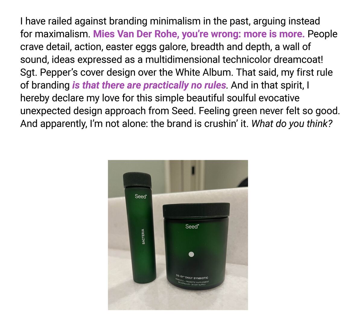
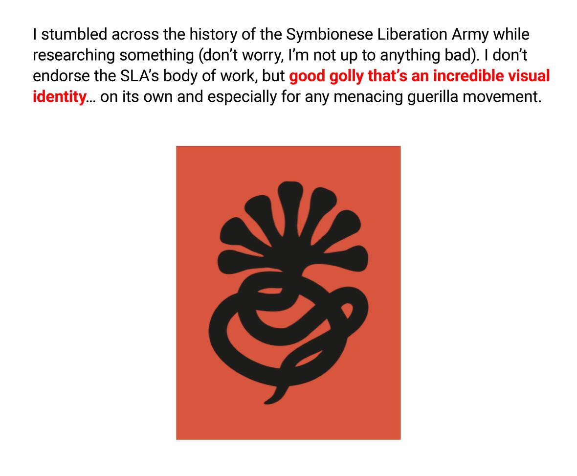
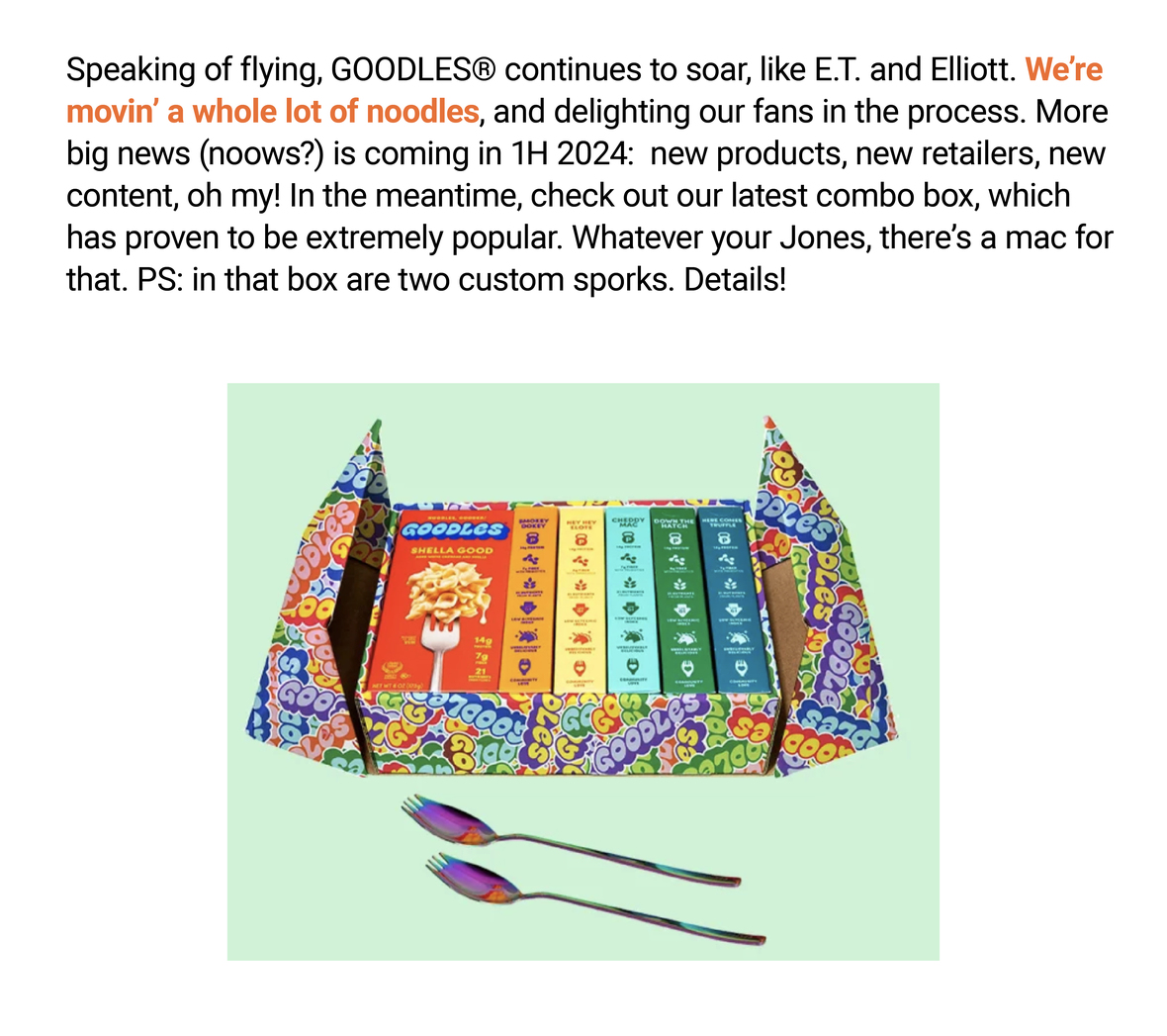
MANIFESTO
About Us
Paul Earle bio
Published
In The News
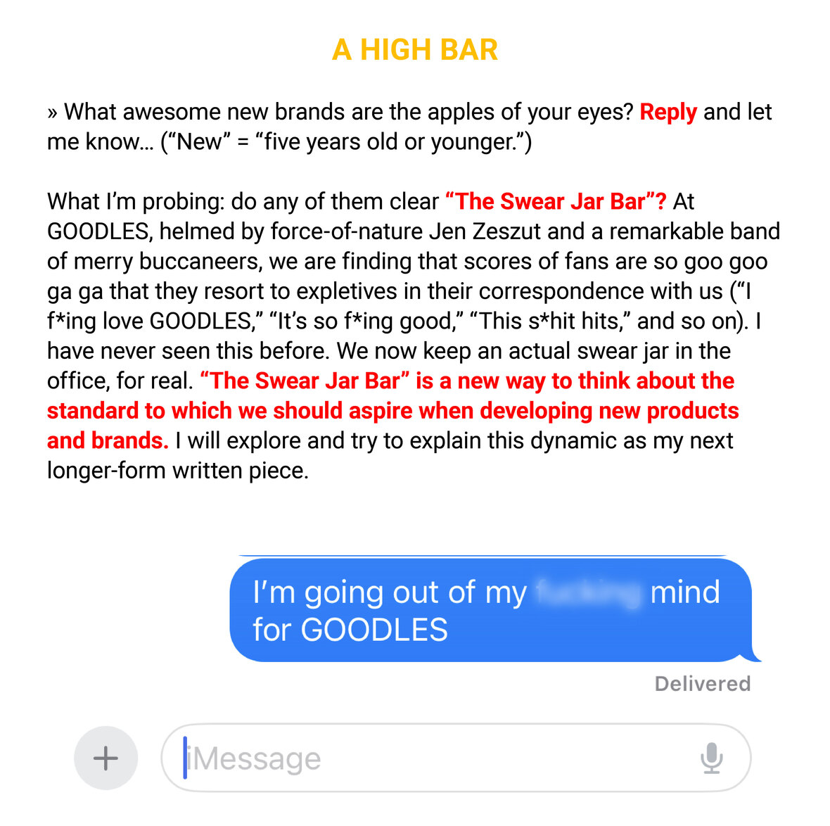
S1/V4
Posted on
December 1, 2023
January 23, 2024
by
adayinthesun
![The image is a simple text-based graphic for a newsletter titled "NEWSLETTER S1 V4." with a date of December 22, 2023. Below the title, it states "By Paul Earle," indicating the author. The text further reads "Musings with a dash of bluster at the intersection of brands, creativity, and entrepreneurship" which suggests the content theme of the newsletter. At the bottom, a playful comment adds "[4-minute read; 2 if you skim; 0 minutes if you blow this off entirely]," which humorously estimates the time it would take to engage with the newsletter's content depending on the reader's level of interest. The text is set against a plain white background, with the title in bold orange letters and the rest of the text in black.](https://adayinthesun.com/wp-content/uploads/2024/01/S1V4-2.jpeg)
![The image shows a piece of text and a photograph of a bird. The text reads:
"Below is a red-winged blackbird, a stunningly beautiful creature. I love the vibrant red/orange/yellow epaulets, the onyx feathers with a sheen, and the perfect proportions in form. As a design nut, chef’s kiss to the red-winged blackbird. This little bird also, however, happens to be a big-time a*shole, a contemptible nasty bastard to the extreme. If you unwittingly roam anywhere near what they believe is “their territory,” they will angrily screech at you... and even physically attack you, dive bombing your head with claws out, and the beak transformed into a weapon. I was a victim of one such attack this fall. This craven act of aggression was not only startling, it really hurt. So I’m plotting my revenge. A longtime fan of biomimicry as a creative approach, I will co opt the red-winged blackbird’s gorgeous design scheme, and use it on a consumer product one day. No royalties. They won’t like that either and will evolve to be even more ornery. Too bad."
The accompanying photograph shows a red-winged blackbird perched on a piece of wood, with its distinctive red and yellow shoulder patches visible against its glossy black body. The bird's mouth is open as if it is calling or singing. At the bottom, there is a caption that says "The Red-Winged Blackbird [Totalum Jerkus Maximus]".](https://adayinthesun.com/wp-content/uploads/2024/01/S1V4-8.jpeg)